The Death Star Depth Chart

NOTE: If you don’t know what an order book or a depth chart are, then this article will make zero sense to you. If that is the case, I would suggest reading my introductory article first.
In a previous life I worked in analytics for a large investment bank. I led a small team of devs, and our job was to build systems to capture public market data as well as a bunch of other stuff that our systems spat out. One of the interesting things about working with data is that you end up spending a lot of time looking at it.
Something they don’t often tell you when you start a data related career, is that one of the hardest parts of onboarding any data set is data hygiene, or how “clean” the data is. Believe it or not, a lot of data sources can be quite dirty, with mistakes arising from capture failure, translation/transmission issues, bad schemas or any number of other issues. When creating a system that stores such data, cleaning it up and normalising it so that it can be used by end users is of paramount importance.
We tend to think of computer systems as ordered and sterile, but in reality they are anything but. Cleaning up a dataset is a thankless task, and typically involves the unfortunate soul having to stare at a dataset for hours, trying to identify potential defects or issues. There are certainly automated tools and heuristics that you can use, but it’s a bit of a chicken and egg problem since you yourself might not even be fully aware of what is “right” and what is “wrong”.
Nevertheless, if you spend enough time doing this, after a while you start to become… familiar… with the data. You start to get an intuition for when it might be wrong, and what kind of data points to expect. You start to get a feel for what queries you need to run to check certain facts or to assess correctness. Do it long enough, and you might start to feel like you understand the actions and intent behind the market data that you are seeing.
Staring Into the Abyss
One of my favourite bits of data has to be level 2 order book data. Not only because how to store it is an industry favourite interview question, but also because this series of numbers provides a window into the intent of the whole market. Anyone who wishes to make an impact on the market, must go through the arbiter that is the order book. There is a whole discipline which involves looking at order books known as market micro structure, and I fondly remember reading articles on sites such as Nanex about various interesting patterns and bad behaviour spotted in markets.
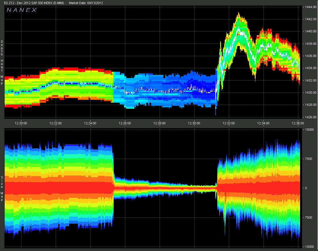
An example liquidity chart from Nanex. Source: 14th Sep 2012 - Disturbing Liquidity
I’ve mentioned before, but in traditional markets most retail traders do not get to see L2 order books or depth charts. Though these seem like almost mandatory features for any existing/aspiring crypto exchange, most Trad-Fi investors will be lucky to see the best bid/ask. One of the motivations for writing my first blog post about order books was because I had been asked multiple times by (non-finance) friends how exactly the price of a stock was determined, and few knew exactly how it worked.
When I first started working in crypto and got far more exposure to level 2 data and depth charts I realised that you could spend several minutes just watching it jump around. Every line on that chart represents one or many people’s orders, and somehow out of all the chaos, consensus would be formed around some sort of price and spread. It was almost hypnotising in a way.
My quant friends usually claim that books are too chaotic to model and predict, but in all the chaos you can still occasionally spot something interesting. Perhaps Nietzsche was right when he said: Stare too long into the abyss, and the abyss will stare into you.
Standard Order Book Visualisation
Most exchanges have a pretty standard way of visualising an order book. The example below used by BitMEX will be familiar to anyone who trades crypto or any other financial markets.
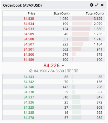
Example L2 order book from BitMEX.
Each row represents a price level, and the quantity of contracts at that level. As such it represents the book in two dimensions: price and size. Such a representation is great for glancing at the book, and getting a rough idea of e.g. the top ~10 price levels, and how much liquidity there is, but there are some downsides.
In the above diagram I deliberately chose an instrument that has slightly lower liquidity. For instance, notice that between certain price levels the gap is unequal. The tick size on this instrument (AVAXUSD) is 0.001, but there are no orders placed on the ask side between 84.459 and 84.500. Despite there being 40 possible price levels between the two, the gap itself is represented as a single level. Therefore, the price dimension is not really represented to scale and can make it less obvious as to how the liquidity is distributed.
Depth Charts
A depth chart solves this issue by eschewing individual price levels for plotting their size on a chart. Both the bid and ask side are represented in green and red respectively. One interesting thing to note about this type of chart is that it is cumulative, meaning that as you move outwards from the middle, the height of the line represents the total quantity added up to that point.
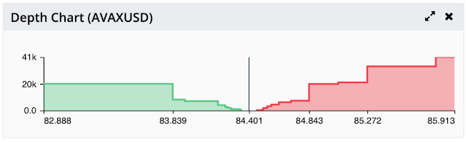
Example depth chart from BitMEX.
This is the equivalent depth chart for the book in the previous figure. Notice that the depth chart shows a much larger slice of the order book than the original diagram. In addition, the spots where there is no liquidity are visible as plateaus (flat lines) in the chart. Due to its cumulative design, the chart can also be used to estimate price impact since looking at the cumulative quantity can show where such a sized market order would move the price to.
Adding Another Dimension
The depth chart represents price and size well, but there is a third dimension that we are missing: time. In any given second order books are changing constantly as participants post, cancel and match orders.
Because the changes happen so fast, it can be hard to tell what actually occurred as it flicks past. In order to do that, we need the ability to see the changes as they happened, preferably in a timeline. We can do this by continuously taking snapshots of the current order book state, and lining them up side by side to form a two-dimensional image. The size is then represented by the color/intensity of the pixel in the image.
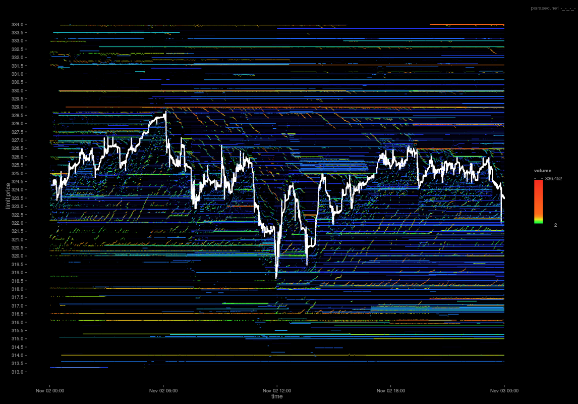
An example of a 2D order book. Source: Parasec - Limit Order Book Visualisation. I highly recommend this article, not least for these diagrams.
As you can see, the image provides the full view of order behaviour during a short period of time. The more red the color, the higher the quantity at that price level. What I love about this image in particular is how you start to see patterns and behaviour in the noise. Notice for instance the small “tendrils” of liquidity that appear to be chasing the mid-price.
The Death Star Depth Chart
Back in time a bit: I found myself in a meeting, being questioned about the utility of the data we were collecting. This was the mid 2010s, and data visualisation was all the rage. d3.js had started to become popular, Jupyter Notebooks were “so hot right now”, and everyone was reading FiveThirtyEight during their lunch break for the latest post election analysis.
There was a palpable sense in the air that since we had all this data, we too should come up with something “cool”. Order books were mentioned, and of course we discussed how we might visualise the data. The usual stuff I covered above was discussed, but I distinctly remember one thing piquing my interest. I have no recollection how it came up, but someone suggested making a 3D scrolling depth chart.
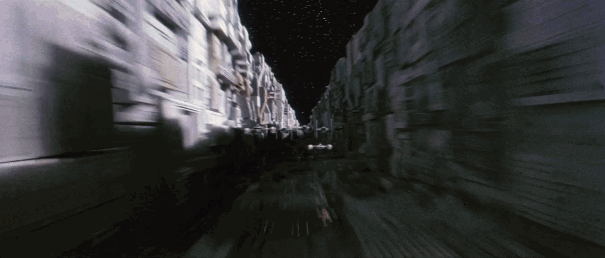
The idea was pretty much identical to 2D chart mentioned above, but instead of using colour to represent size, we could use a 3D rendering. It was explained to me as follows: “It would look a bit like that scene in Star Wars where they are flying the x-wing through the death star”.
Finance analogies. Source: geekscovery
Sadly (and perhaps understandably), most of the data instead ended up silently being pumped into various historic databases or other black boxes. A Star Wars themed visualisation for the trading floor was perhaps too avant-garde, even for that time period. However, the idea for a 3D depth chart stuck with me. To be fair, it turns out this is not really a novel idea. It’s been done before, notably by Nanex who built something similar as part of their JTools suite of apps.
Nevertheless, I recently found not only the time, but the means to try and build it. Some of the stuff people have been building using WebGL is really impressive, and having read the tutorial for three.js I realised it was actually pretty easy to put something decent looking together. This stands in stark contrast to my experience trying to use OpenGL with C++ and Win32 back when I was a teenager, which could loosely be described as “traumatising”.
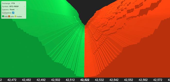
So yeah… over about a week I managed to put together something that had been stuck in my brain for the best part of half a decade. You can check it out at www.3dorderbook.com, as well as check out the source code on GitHub.
I still can’t figure out how to make materials not look flat in OpenGL :(
I had the feedhandlers from my previous CryptoSOR project lying around, so I added some of the big CeFi exchanges such as Binance, BitMEX and FTX as well as a DeFi exchange (Mango Markets) for comparison. You can select whether you want the price levels to be cumulative or not by clicking the toggle, which will show you the liquidity as either a series of spikes or a valley. If you want to see where specifically the liquidity is, then the non-cumulative mode is probably most useful.
There are also three camera options that I cobbled together so you can change your perspective:
- Front
- Follows the mid-price from the front of the diagram, i.e. the latest order book.
- X-Wing
- In living up to the inspiration, this mode places you about 10s behind the latest book looking forwards. The camera will then snake through the book following the mid-price, (sort of) simulating the Star Wars trench run.
- FPS
- A.K.A First Person Shooter. Look around with the mouse and move with WASD or the arrow keys. This mode doesn’t work properly on phones, and is not ideal due to the difficulty of doing proper FPS controls while still allowing free mouse movement.
Pay attention also to the yellow balls that represent trades. Given more time there are a variety of improvements to be done. For instance, the current system just snaps the book and trades continuously and does not use the timestamps sent from the exchange. This can sometime lead to incorrect positioning of the book or trades. To do it properly you would need to use these instead and normalise using them. Performance is not bad but not great either, and someone more skilled with graphics programming probably could point out a variety of improvements.
What I like about it is that it too has the similar hypnotic properties of the depth chart, but with even more context. Also, the rolling valley it creates in cumulative mode gives me some of that early 2000’s OpenGL heightmap nostalgia that is hard to find these days.
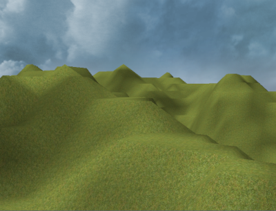
This was peak graphical performance back in the day. Source: StackOverflow - OpenGL heightmap terrain and normals with low resolution
How useful is it for trading? Well, arguably the 2D diagram is probably more useful. It is much easier to present and analyse, especially since the 3D version can actually obscure information due to camera perspective. However, I do think that one thing that it does do better is give you a physical feeling of what is going on. There is something about physical blocks of “stuff” moving that speaks to me more than pure colours. It is also easier to judge relative size of peaks in 3D space than in colour space.
Interesting Things to See
When you see an order book on an exchange, what you are actually seeing are the orders of hundreds possibly thousands of people as well as programs. Each one has their own individual goals and strategies, and therefore different orders in the market.

A superposition of market participants.
What the order book is, is really a summation of all of these individual users and their orders. The resultant superposition of orders usually results in chaos. However, occasionally some patterns shine through. To do a really deep dive requires a lot of time and patience, but below I list out a few obvious ones:
Tight and Wide Spreads
The spread is defined as the distance in price between the best bid and best ask. How tight (small) or wide (big) the spread is can vary wildly between markets. For instance, take a look at USDT-PERP on FTX. This is a perpetual future that has the Tether stablecoin as the underlying, quoted in regular USD (actually a basket of stablecoins) on FTX.
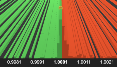
USDT-PERP liquidity on FTX
Notice that since the value of tether (in theory) should be 1 to 1 with USD, the price stays almost completely unmoving around 1.0. Because little volatility is expected, the majority of market makers will quote right around the best bid and ask, causing a tight spread. You can clearly see in the image that almost all of the liquidity is piled up right in the middle. Compare this to a more volatile instrument, such as CRV-PERP on FTX:
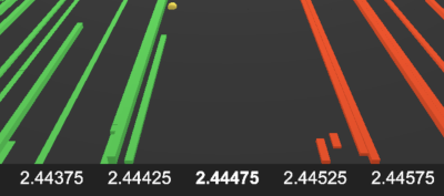
CRV-PERP liquidity on FTX
Notice that on this instrument the spread is much wider, with small amounts of liquidity spread out. Generally speaking, such differences occur when instruments are more volatile, and the fair price is less clear. Market makers will quote wider on such instruments because this gives them a buffer if the instrument whips in one direction.
“Real” Liquidity
Following on from the above, there are certain symbols that on the surface look like they have tight spreads, but in actuality have much wider spreads. For instance, check out the liquidity distribution for LUNA-PERP on Mango Markets:
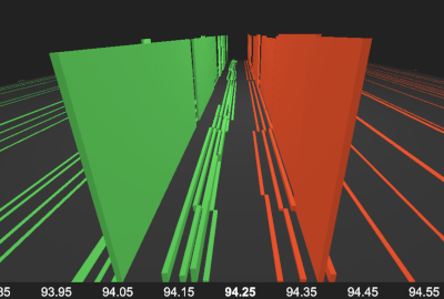
LUNA-PERP liquidity on Mango Markets
Ostensibly the spread looks tight-ish (for a DeFi exchange anyway) at 94.20/94.30 (10bps). However, in reality the vast majority of the liquidity is at a much wider price range of 94.05/94.40 (37bps). For comparison, there is about \$2,000 worth of liquidity at the top of the book, while the larger blocks have \$30,000. This is why when quoting liquidity, impact prices are important, and why sending blind market orders (based on the top of book) can be exceedingly dangerous.
That’s not to say the liquidity at the top of the book is fake, it is absolutely there for the taking. However, any serious sized trade would blow through it instantly. These tighter prices are generally only available to small-time retail traders, who will not do significant (and therefore risky) volume. This type of distribution is common in low liquidity and highly volatile markets where professional market makers (who have a better read on the risk) will not be willing to quote tightly in large sizes.
Buy and Sell Walls
Buy and Sell Walls are very large passive orders placed at a specific price level either on the bid or ask side respectively. They are sometimes also called whale walls due to the conspiracy that they are being placed by crypto “whales” who own a large portion of a cryptocurrency. Because level 2 books are anonymised and aggregated, it is difficult to discriminate between a wall and a bunch of limit orders that happen to have the same price. The connotation with walls however, is that they are being used for some sort of manipulative purpose, rather than for actual trade.
The idea supposedly is that because e.g. a buy wall is so large, this is a positive buy signal to the market. It also encourages other participants to place their buy limit orders above the wall, since they assume that due to the wall’s size it will not be likely for their limit orders to fill with the wall in the way. In this way, the wall is being used as a psychological trick to try and drive the price in a particular direction. Below is a possible example of a wall on BNB-PERP on FTX, though obviously it is impossible to tell definitively.
Market Maker Ladders
A common pattern you can see is market makers placing a series of orders at increasingly deeper prices either side of the mid-price. This is sometimes called order laddering, and is a way of deploying liquidity in such a way as to increase the cost of the liquidity as more is requested (similar in many ways to an AMM). Frequently, these orders are placed symmetrically, and therefore are easy to pick out in the book. Take a look at this market maker on Mango Markets placing a small 4 -a-side ladder on AVAX-PERP:
There are actually two market makers working this book at the same time with different strategies. In addition to the ladder market maker shown, there is another who is quoting large blocks at a wider spread. What is interesting is that either the second market maker is quoting asymmetrically (i.e. not the same offset from the mid-price on each side), or is using a different fair price from the other. This is why the two sets of orders are not perfectly aligned.
The final interesting thing to note here is how whole blocks of orders change instantaneously. Most CeFi exchanges require you to send orders one by one, and therefore you expect a complex ladder to take a short amount of time to form. Mango Markets however uses an on chain order book, meaning that orders are placed using a series of instructions bundled into one transaction. This mechanism allows market makers to cancel all their orders, and place a ladder atomically or all in one go. Notice in the video how the complex order structure both disappears and re-appears instantly.
Try It Yourself
Maybe it really is all chaos, or maybe there is some order in the madness. Why not try it yourself? Find an order book you like the look of, put on some synthwave and stare deeply into the abyss…